
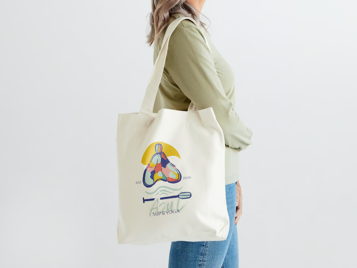
Basic Logo and Brand Design for Azul SUP & YOGA
The logo embodies a vibrant, modern aesthetic with a playful, organic touch. It masterfully blends abstract shapes with simplified iconography, creating a visually appealing and harmonious composition. The artistic style strikes a balance between geometric precision and freeform fluidity, resulting in a design that feels both contemporary and approachable. This unique visual language effectively captures the essence of the business's diverse offerings, from water activities to mindful practices.
The owner's decade-long search for the perfect logo underscores the significance of this design. Her persistence paid off in a logo that beautifully integrates key elements of her business: the stylized cacao bean, a nod to her cacao ceremonies, seamlessly merges with the paddle motif representing SUP yoga. This thoughtful combination not only reflects the owner's diverse practices but also creates a distinctive and meaningful brand identity that was worth the wait.
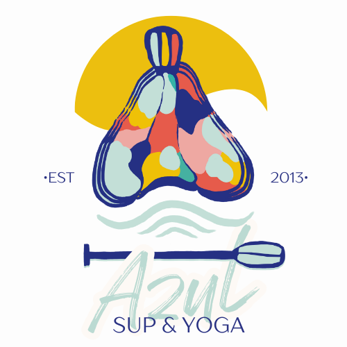


This logo is a colorful and stylized design for "Azul SUP & Yoga," established in 2013. Here's a breakdown of its elements:
1. Abstract paddle: At the bottom of the logo, there's a simplified, linear representation of a paddle, likely for stand-up paddleboarding (SUP).
2. Cacao bean-like shape: The central element resembles a stylized cacao bean or pod. It's composed of various organic, curving shapes in different colors including blue, orange, pink, yellow, and light blue.
3. Water element: Below the main design, there are a few wavy lines representing water, connecting the concept to water-based activities.
4. Text: The word "Azul" is written in a cursive, handwritten style across the paddle. Below it, "SUP & YOGA" appears in a simpler, sans-serif font.
5. Establishment date: "EST 2013" is split on either side of the main design.
6. Color scheme: The logo uses a vibrant color palette dominated by a bright yellow background circle, with the other elements in various cool and warm tones.
7. Style: The overall aesthetic is playful and organic, with smooth lines and shapes that give it a hand-drawn feel, despite being created digitally using Photoshop and Canva.
This logo effectively combines elements related to both paddleboarding and yoga, suggesting a business that offers both activities, likely in a beach or water-related setting.